
The dancers needed to come out of the logo. They didn't need to leave the brand.
That distinction came up during a dance studio rebrand, and it's one I want more business owners to know before they start worrying about everything they might lose. Maybe you still love the color customers associate with you. Maybe your logo has a story that matters, even though you dread trying to put it on another Instagram graphic. You've put time into building a business people know and recognize. It makes sense to care about those details.
When I’m working on a rebranding project, at the very beginning I want to know what's already doing a good job and what could do a better one. Sometimes an element can stay right where it is. Sometimes the idea is worth keeping, but it needs a different form or a different place in the brand.
Start with what people already know
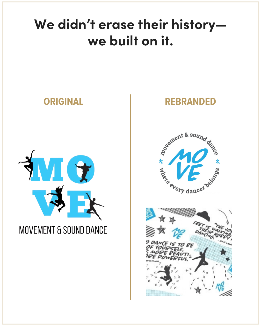
Movement & Sound Dance started with a logo its owner made in Canva when the studio first opened. I loved the idea behind it. She shortened a long studio name to “MOVE,” stacking MO over VE in bold block serif letters. She added dancer silhouettes and the studio’s turquoise. The logo had personality, and those elements became familiar to the families who knew the studio. That first logo had served them well.
As the studio grew, it needed an identity that could work across more places and at more sizes. The dancers brought energy to the original logo, but together they made the mark busy and hard to use when it was small. The ideas were still good. They needed more room.
The owner knew she wanted to keep the turquoise. I saw value in keeping the stacked lettering and the dancers too. I refined the type, then pulled the dancers out of the logo and reimagined them as illustrations for the studio’s graphics. That let the logo become clearer while the dancers could show up on apparel, marketing materials, and other pieces of the brand.
The updated identity felt familiar to people who knew Movement & Sound, while giving the studio a more polished and flexible way to show up.
Keep the meaning, even when the design needs to change
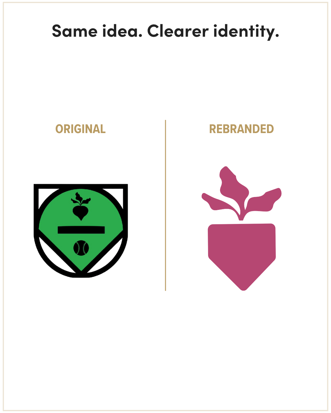
Home Plate by Lindsey called for a different kind of editing. Among many talents, Lindsey is a softball pitching coach and works with clients on nutrition and wellness. Her brand needed to bring those parts of her work together. She already had a logo with a lot of personal meaning: it combined a softball field, a dinner plate, a softball, and a beet. Each part stood for something important to her. It was a thoughtful way to bring her ideas together at that stage of her business.
For the next version of her brand, we needed the connection between those services to come through more clearly. Once Lindsey explained the symbolism in her original logo, I could see it. Someone seeing it for the first time on a website or sweatshirt wouldn't have that context, though, and so many details were difficult to read at a small size. Instagram profile photos are not generous with space.
A logo needs to work without an explanation. It doesn't have to spell out every service or reveal every layer of symbolism immediately, but it does need to be recognizable, usable, and clear enough to make an impression on its own.
So we kept the idea Lindsey cared about: the connection between athletics and nourishment. The new symbol combines the shape of a home plate with a beet. The home plate speaks to softball; the beet brings in food and wellness. It holds onto the heart of her original concept without asking one small logo to illustrate every part of her work.
That meaning mattered deeply to Lindsey. When she saw the finished brand, she told me, “Somehow this brand captures everything I do, and everything I believe in. I feel so seen.”
If there's a story behind an element of your brand that still matters to you, you don't have to give up the story. You may just need a clearer way to tell it.
Give every piece a job
If you're considering a rebrand, pull up your logo, website, and a few recent marketing pieces. Instead of giving the whole brand a thumbs-up or thumbs-down, make three quick lists:
Keep: What still fits and works well? Think of a color people recognize or a phrase that still sounds like you.
Rework: What has meaning but causes problems in use? Maybe there's a strong idea inside a complicated logo, or a graphic you love that would work better outside it.
Let go: What reflects an earlier version of the business, confuses people, or makes routine design work harder for no good reason?
You can make those lists without knowing what your new logo should look like. Try shrinking the current one to profile-photo size. Notice which details disappear. Pay attention to anything you find yourself explaining every time you show it to someone. And write down the pieces people already recognize, even if they don't seem particularly exciting to you anymore.
You don't have to settle the design decisions on your own. You're looking for better questions to bring into the process: Why does this matter to me? Does it still represent the business? Is it working where I need to use it?
Keep the color if it's become yours. Keep the story if it still feels true. Keep the dancers—just don't make them all squeeze into the logo. You may find that a surprising amount of what you love still belongs in your brand. It simply needs a little more room to work.
Want to talk through what a rebrand could mean for you?
You don’t need to know what should stay or what should change before we talk. We can start with what you love about your current brand and where it’s getting harder to use.
Schedule a consultation and let’s talk it through.
