Fun, but never childish
Designed for dance educators, this identity combines playful energy with professional clarity—so the brand feels just as smart as the products behind it.
Dance Dance Hooray creates lesson plans, games, and teaching tools for educators who teach children’s dance. What began as a side project had grown into a larger library of resources. Its brand needed to grow with it, so the business looked as thoughtful and well made as the materials teachers were using.
The Challenge
The resources are full of play and movement, but the people choosing them are teachers. The existing Canva logo had served the business in its early days; now the brand needed to look more cohesive and credible to educators without losing the joy that makes the resources appealing.
The Thinking
Dance Dance Hooray’s resources bring play and creativity into children’s dance classes, but the brand speaks to the educators choosing and using those resources. That meant giving it plenty of energy and movement, with enough clarity and polish to feel like a dependable teaching resource.
The Design
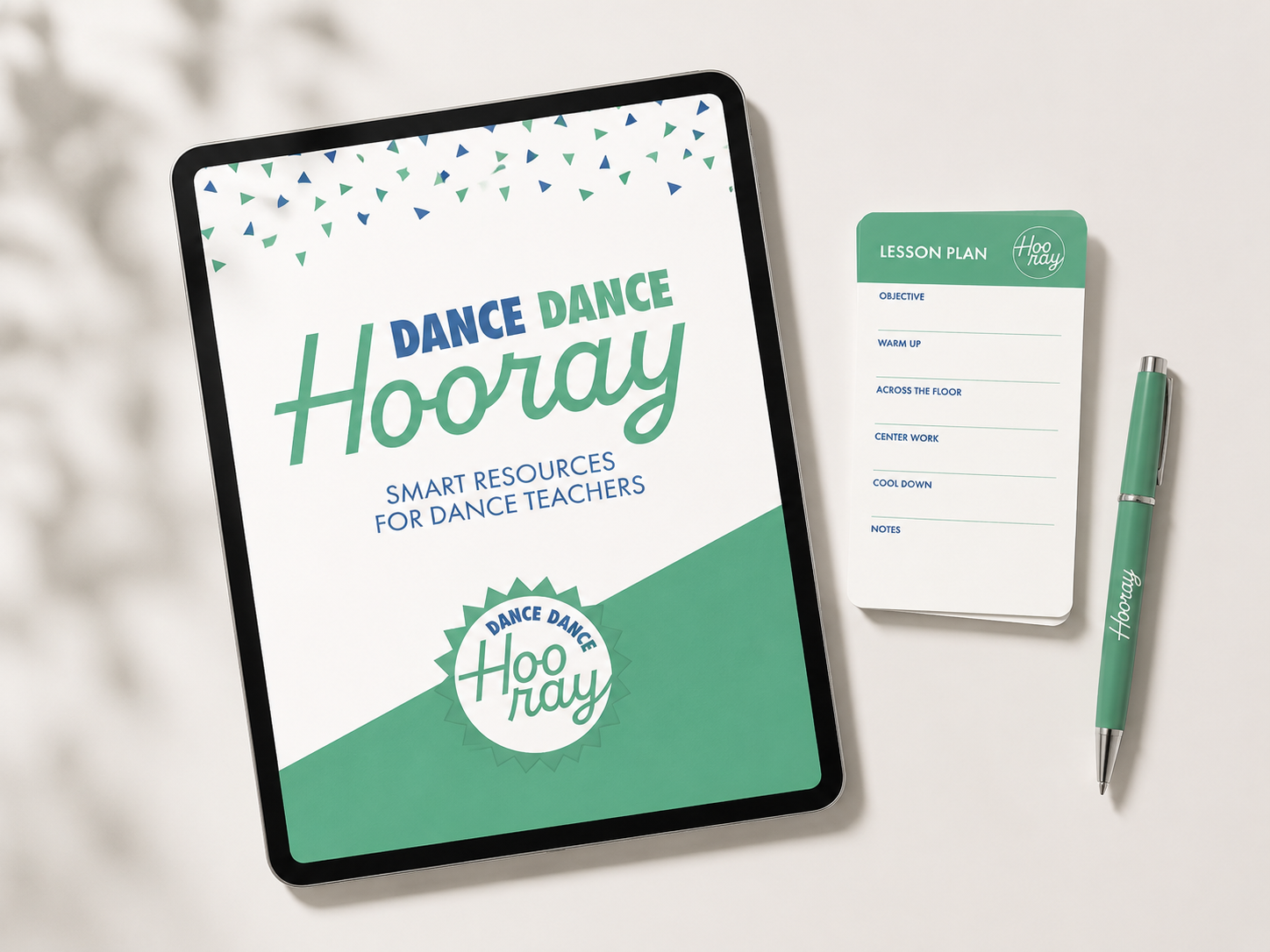
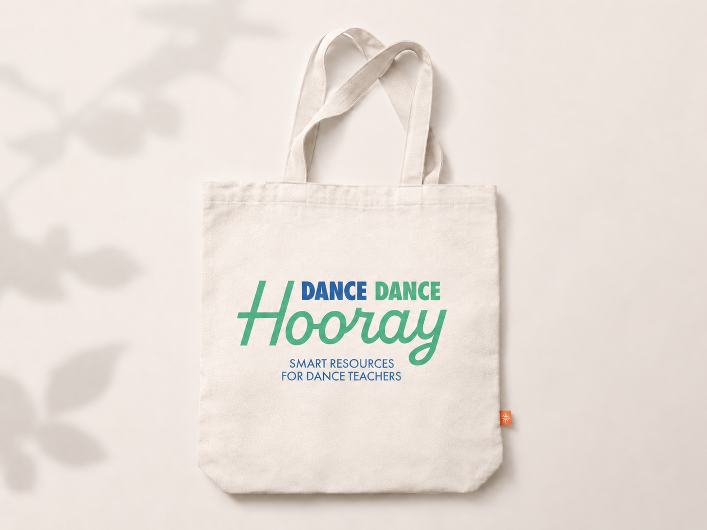
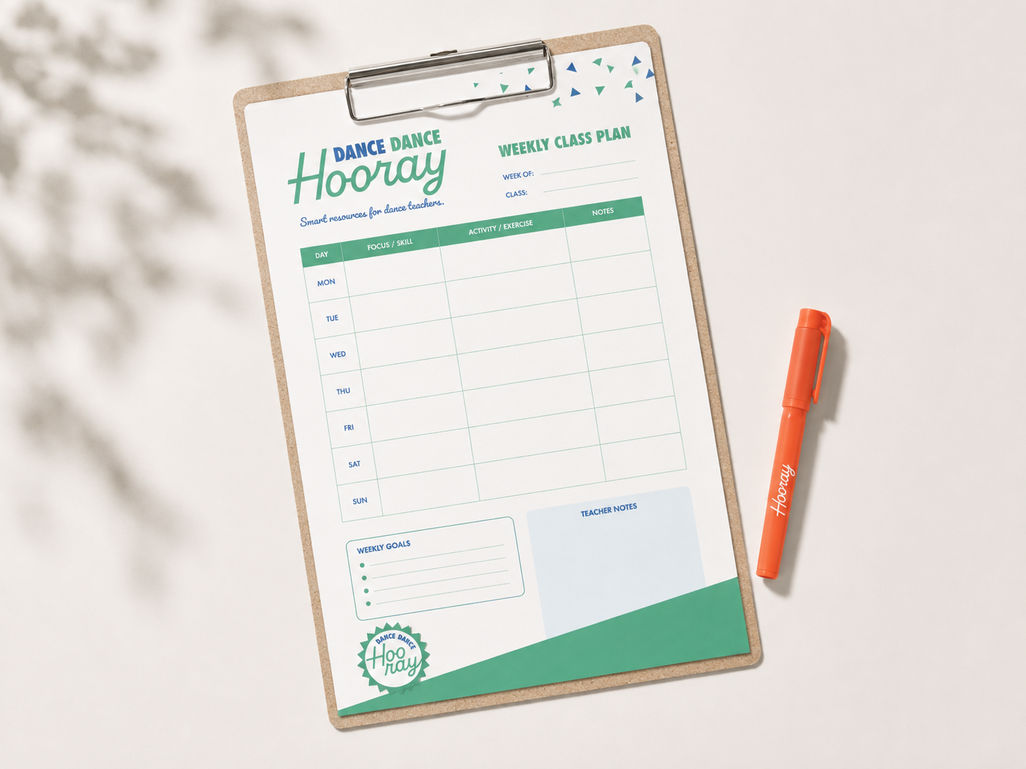
Bold lettering, a lively color palette, and graphics inspired by rhythm and movement bring the brand’s energy to life. The logo system and supporting pattern give Dance Dance Hooray a recognizable look across its resources, social posts, and marketing materials. Each piece can be playful while still looking like part of the same business.
The Result
Dance Dance Hooray now has a polished, recognizable identity that reflects the quality of its teaching resources. The owner has a cohesive visual system she can use across new products, social posts, and other materials as the business grows.
Project Scope
Brand identity redesign